Building brand authority—and shaping a vision for the circular economy while we're at it.
As Rheaply's Brand Designer, I led a comprehensive rebranding initiative to revamp their brand identity, focused on creating a cohesive and engaging visual identity to strengthen market impact.
My role involved directing the rebranding process from research to implementation, collaborating with cross-functional teams including marketing, sales, and product.
Project goals
Create a Strong Visual Identity
Develop a brand narrative and visual style that resonates with Rheaply's mission and values while differentiating their fresh vision for the Circular Economy in the market.
Develop a brand narrative and visual style that resonates with Rheaply's mission and values while differentiating their fresh vision for the Circular Economy in the market.
Enhance Customer Journey
Align the new brand identity with the customer journey for improved engagement and experience.
Align the new brand identity with the customer journey for improved engagement and experience.
Support Marketing and Sales
Create compelling marketing assets to strengthen Rheaply’s market positioning.
Create compelling marketing assets to strengthen Rheaply’s market positioning.
Thought process & strategy
Research and User Insights
Engaged Threadline to create a brand narrative through interviews with key users and target audiences to define the ideal brand image.
Engaged Threadline to create a brand narrative through interviews with key users and target audiences to define the ideal brand image.
In collaboration with product designers, developed semantic profiles and aesthetic principles to guide the brand direction and its implementation.
Brand Narrative and Visual Identity
Visually communicated a cohesive brand narrative reflecting Rheaply's mission and user needs.Reconstructed the logo for a more balanced, professional appearance.
Visually communicated a cohesive brand narrative reflecting Rheaply's mission and user needs.Reconstructed the logo for a more balanced, professional appearance.
Kiley’s mark on Rheaply is still present today. She created the design concepts behind Rheaply’s brand identity and narrative, focusing on the people, items, and stories behind the circular economy movement. She took physical asset management – something that, historically, has been very boring and banal – and turned it completely on its head. Her designs brought wonder and excitement to many of my videos, investor pitches and presentations, and carried us through those major milestones and moments. In fact, she was the lead and key designer for my TED talk.
Garry Cooper
CEO, Co-founder
CEO, Co-founder
Collaboration and Feedback
Trained marketing, sales, and product teams separately to ensure alignment with company goals.
Trained marketing, sales, and product teams separately to ensure alignment with company goals.
Integrated feedback throughout the process to ensure the brand resonated with stakeholders.
Design Process
Logo and Typography:
Redesigned the logo for a cleaner and more versatile look.
Redesigned the logo for a cleaner and more versatile look.
Chose modern, approachable typography to reflect Rheaply's identity.
Color Palette:
Collaborated on a color palette of warm blues, light sand, and green to create a welcoming feel.
Collaborated on a color palette of warm blues, light sand, and green to create a welcoming feel.
Prioritized color accessibility and readability.
Website and Marketing Materials
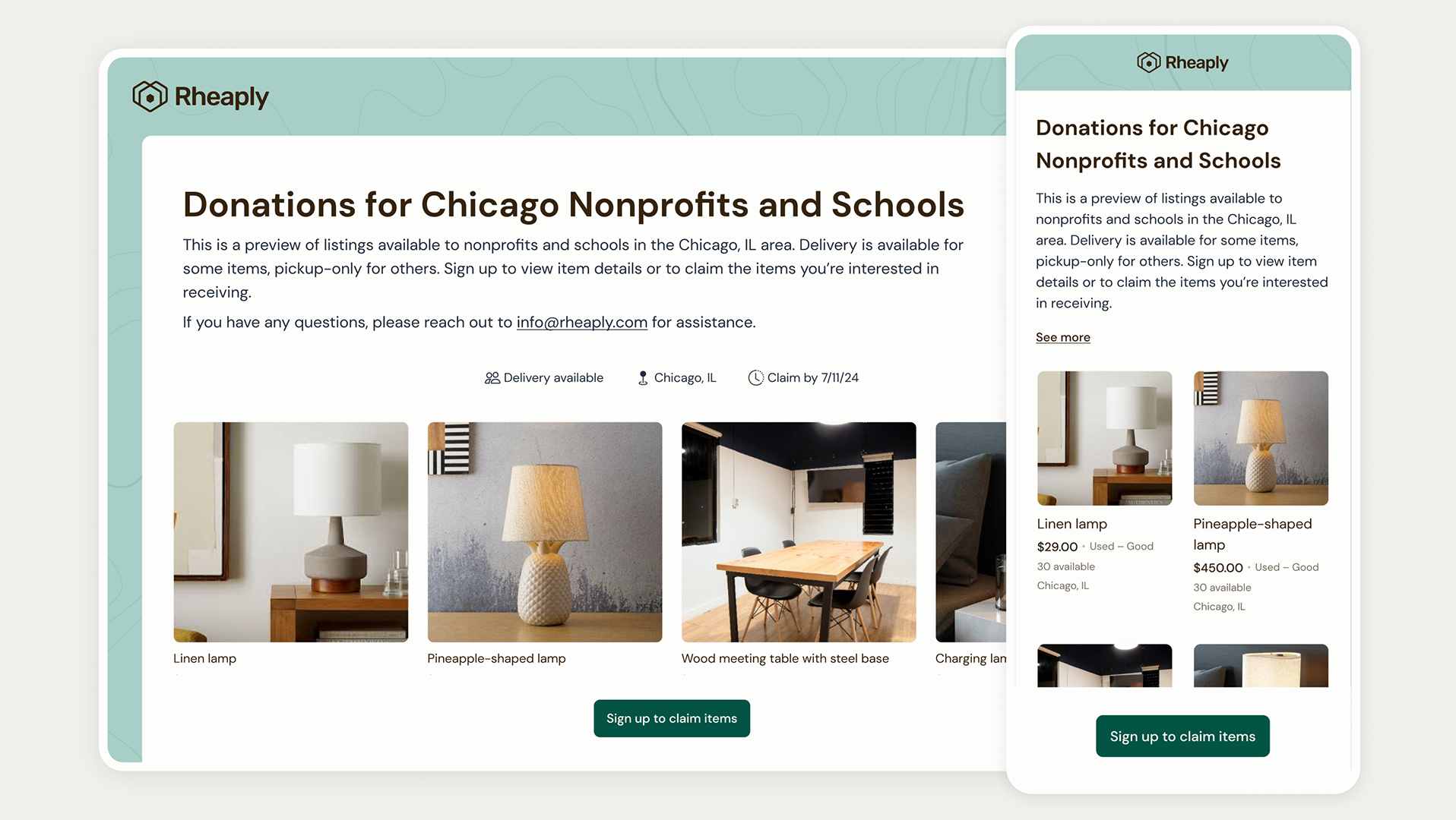
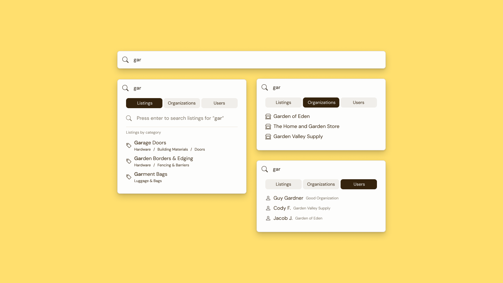
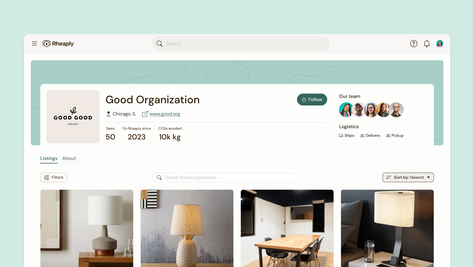
Directed a website redesign and developed a foundational design system in Figma.
Directed a website redesign and developed a foundational design system in Figma.
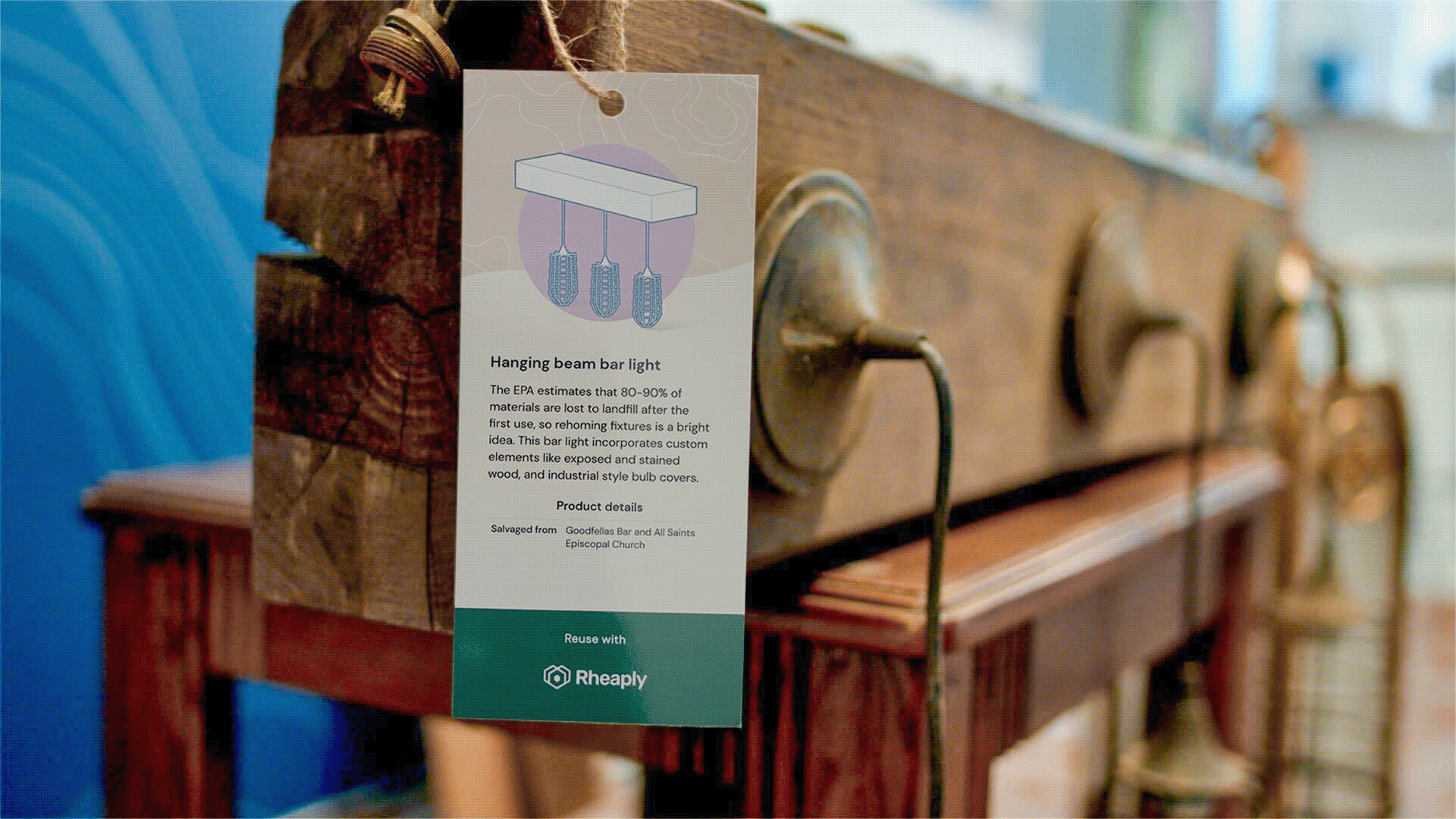
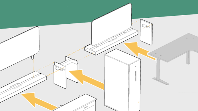
Created a suite of marketing materials, including brochures and custom illustrations.
Fully redesigned, rebuilt, and remastered website built with Yvonne at Flowspoke
During my tenure, Rheaply's domain authority went from nothing (2) to excellent (62).
Rheaply is now a top searched site in North America for circular cities and circular economy related keywords.
Kiley's designs transcended how we think about the business of circularity at Rheaply. She created designs that brought Rheaply to life, that took a complex system like the circular economy and made it simple, delightful, and provocative.
She created our first brand narrative and guide that is still used today, that would stand the test of time and rapid changes that happen at a startup.
Thomas Fecarotta
Head of Marketing Communications
Head of Marketing Communications
Outcomes
Aligning the new brand identity with Rheaply's evolving business needs.
Developed a flexible design system adaptable to future growth.
Provided tailored training for consistent brand implementation.
Established a unified visual identity that boosted Rheaply's market presence.
Supported marketing with engaging, high-quality assets.
Created a brand that resonated with users, improving overall engagement.
Reflection
Learning
Gained insights into the importance of visual identity in driving market impact.
Gained insights into the importance of visual identity in driving market impact.
Growth
Strengthened skills in brand strategy and cross-team collaboration.
Strengthened skills in brand strategy and cross-team collaboration.
Team
Director, Brand Strategy: Adam Arcus
Brand Design: Kiley Kielland
Color and Graphic Design: Gabrielle Lenting
CMO: Thomas Fecarotta
Brand narrative: Threadline
Web design: Flowspoke

